

18th February 2026
2026 Palette Forecast — The Warm Shift
The Warm Shift
After more than a decade in which cooler palettes defined much of contemporary residential architecture, a subtle recalibration is beginning to surface across material selections.
This is not a rejection of grey, nor a decisive swing toward overt warmth. Rather, it reflects a growing preference for interiors that feel materially balanced — spaces combining clarity with a greater sense of composure, durability, and liveability.
Recent editions of Maison & Objet have hinted at this direction. Mineral beiges, softened browns, limestone tonalities, and surfaces with restrained contrast are appearing with greater consistency — not as decorative departures, but as foundational elements within contemporary environments.
Importantly, the change is not being driven by a single material category. It is emerging through a broader alignment of finishes — stone, timber, metals, and joinery — that together signal a more controlled interpretation of warmth.
Three signals, in particular, are beginning to clarify the direction of travel.
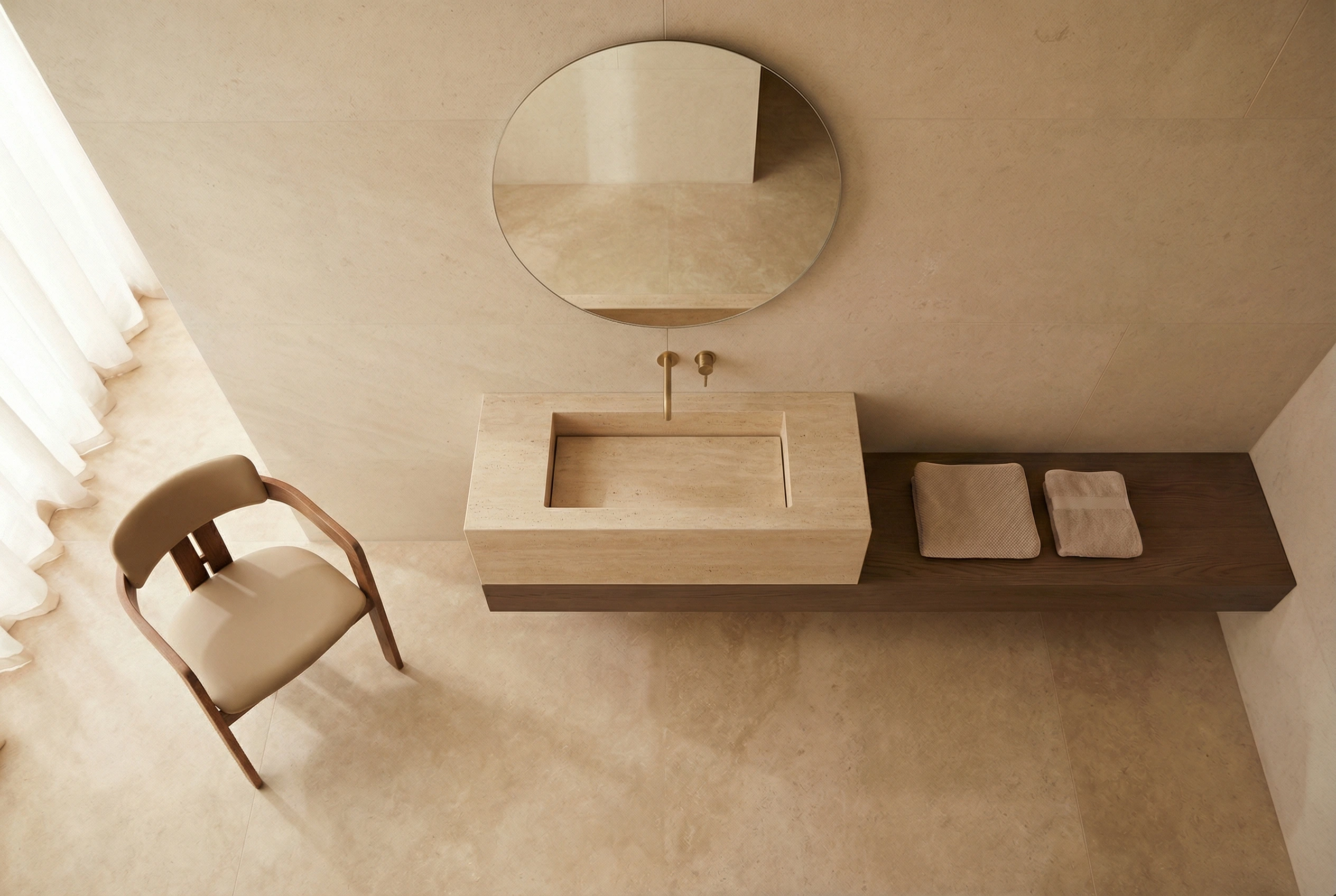
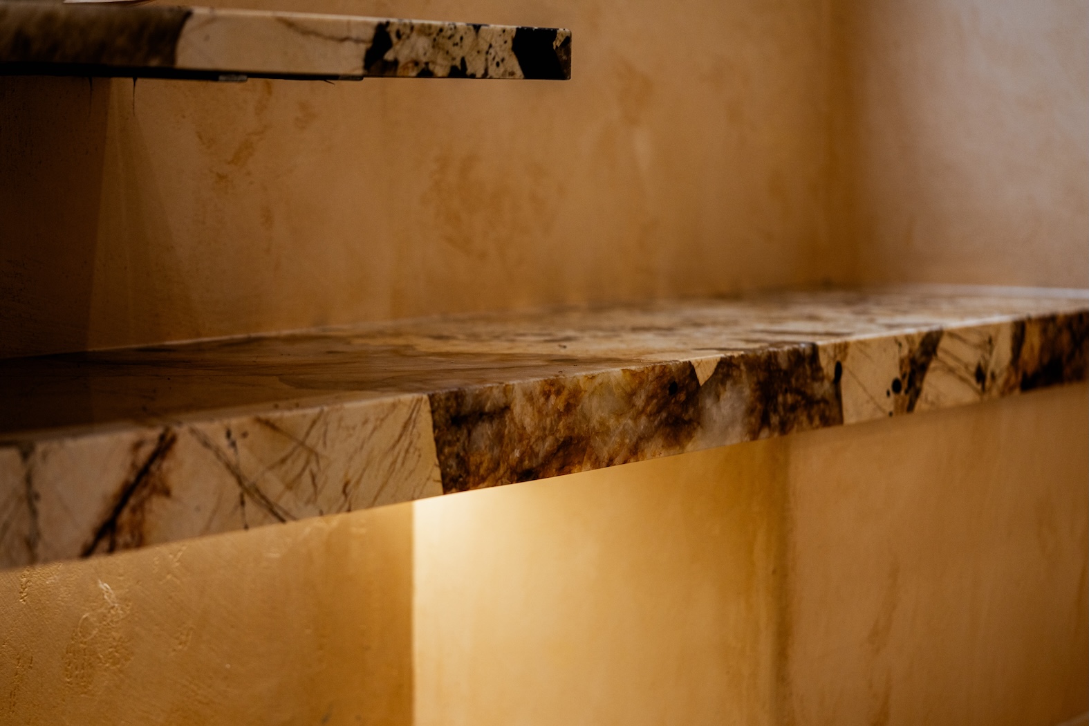
Signal 01 — Tonal Range Is Broadening
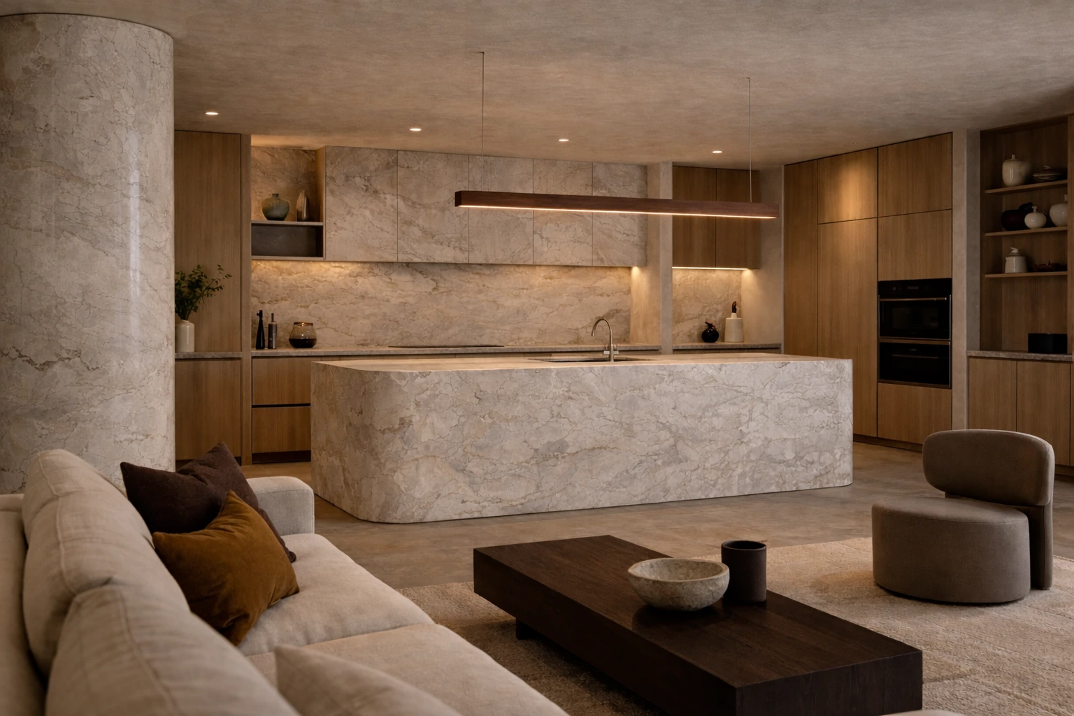
Signal 02 — Surrounding Materials Are Moving Warmer
Material direction rarely shifts in isolation. One of the clearest supporting indicators is visible in joinery and metal selections.
Studios including Vincent Van Duysen Architects continue to demonstrate interiors where deeper timbers and muted metals create a quieter spatial atmosphere. As these elements warm, surfaces that once provided deliberate contrast are increasingly expected to contribute to overall cohesion.
Warmer stones tend to absorb light more gently than cooler materials, reducing visual sharpness while maintaining clarity. The result is often an environment that feels settled rather than staged.
For homes designed around long-term occupation, this cohesion carries practical value.
Signal 03 — Liveability Is Informing Developer Decisions
Developer-led projects often provide a pragmatic view of where residential preference is heading. Material selections in these settings must balance visual appeal with adaptability and longevity.
Warmer palettes perform consistently across these criteria. They photograph with less starkness, accommodate changing interior layers more easily, and typically show less visual fatigue over time.
As a result, some multi-residential schemes appear to be stepping away from high-contrast compositions in favour of environments that communicate softness while maintaining a contemporary reading.
For specifiers operating within commercial constraints, this adaptability can help reduce long-term risk.
Collectively, these indicators suggest that warmth is no longer emerging at the margins of residential design — it is entering the specification mainstream. As interiors prioritise longevity alongside visual composure, material decisions are carrying greater architectural weight. The most effective way to assess this direction is not conceptually, but physically — through materials that can be handled, compared, and understood in real light.
Request samples to evaluate the palette and specify with greater certainty.