Within that group, three stones are leading specification so far this year. They’re not the loudest or most trend-driven selections. Instead, they reflect a more deliberate shift toward warmth, tactility and controlled variation — materials that resolve space rather than dominate it.
Across residential, multi-residential and commercial projects, the same underlying drivers are evident:
-
Texture over polish
-
Warm neutrals over cool greys
-
Composed surfaces over high-contrast statements
These are not stylistic preferences alone — they’re functional responses to how spaces are now being designed, experienced and scaled.
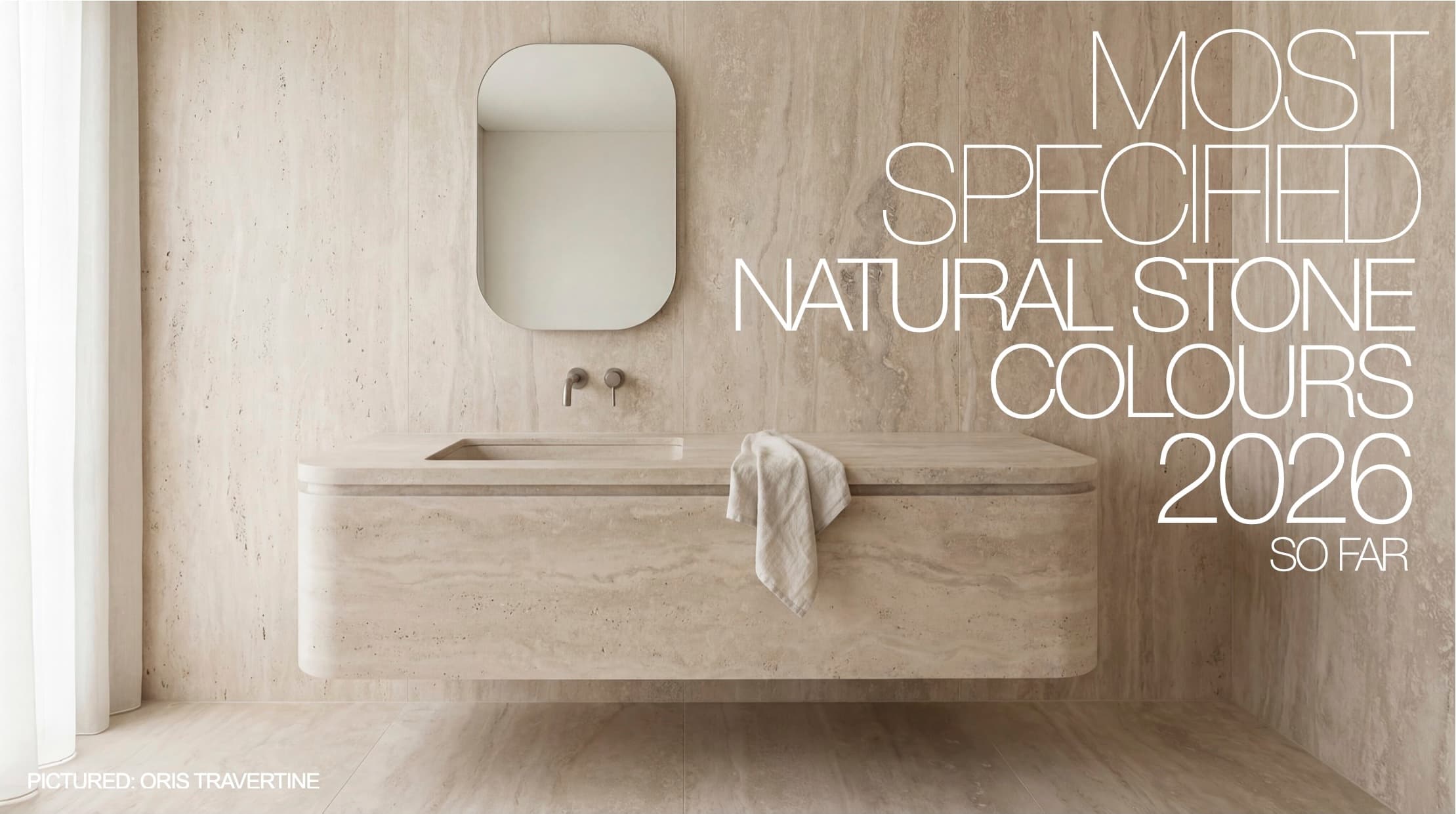
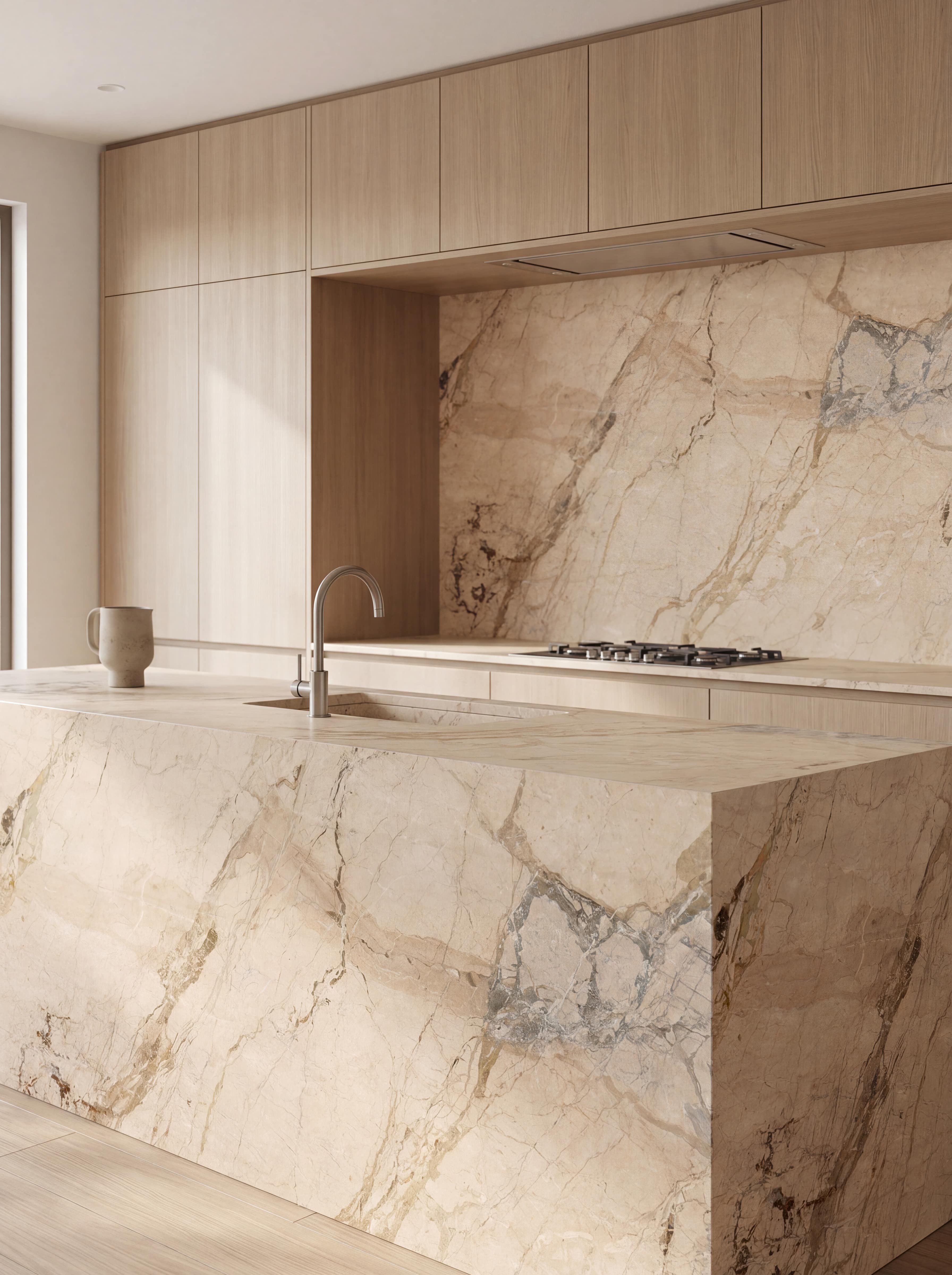
Oris Travertine
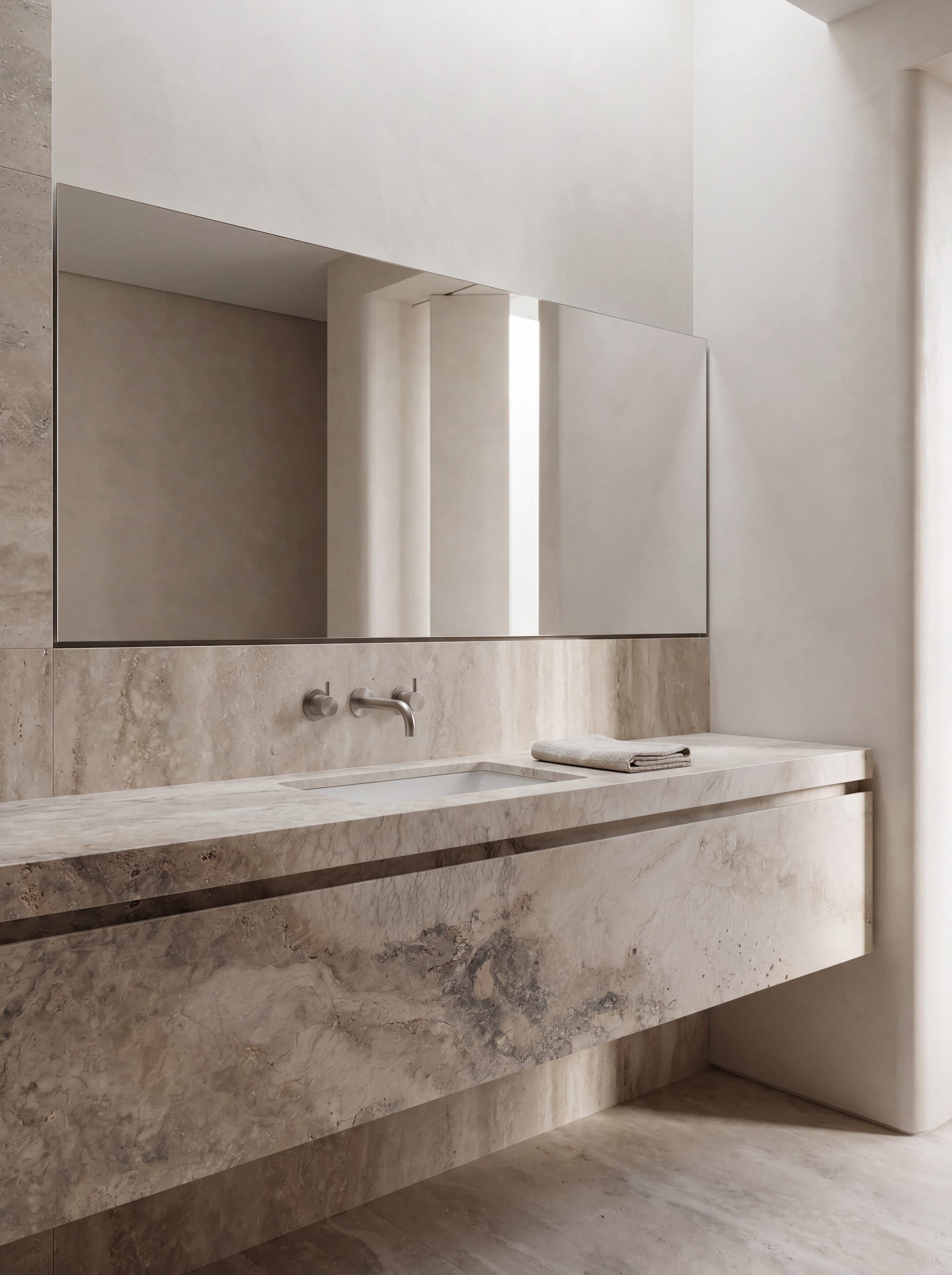
Oris Travertine is defined by its porous, “blue cheese” style structure — a cross-cut formation that reveals clouded mineral patterns and natural voiding.
It brings depth through texture rather than direction.
Why it’s performing:
- Aligns with the shift toward tactile, mineral surfaces
- Adds visual richness without contrast-driven design
- Works across walls, bathrooms and feature applications
- Creates atmosphere through material, not styling
The Shift
There is a clear move toward a more elevated application of travertine.
Rather than the heavily filled, repetitive or overtly “Mediterranean” expressions seen in past years, current specification favours:
- More natural, open texture
- Larger, uninterrupted surfaces
- Controlled, architectural application
- Reduced reliance on decorative detailing
The result is a travertine that reads more resolved — less styled, more considered.
ORDER AN ORIS TRAVERTINE SAMPLE FOR YOUR PROJECT
Super Cedar Marble
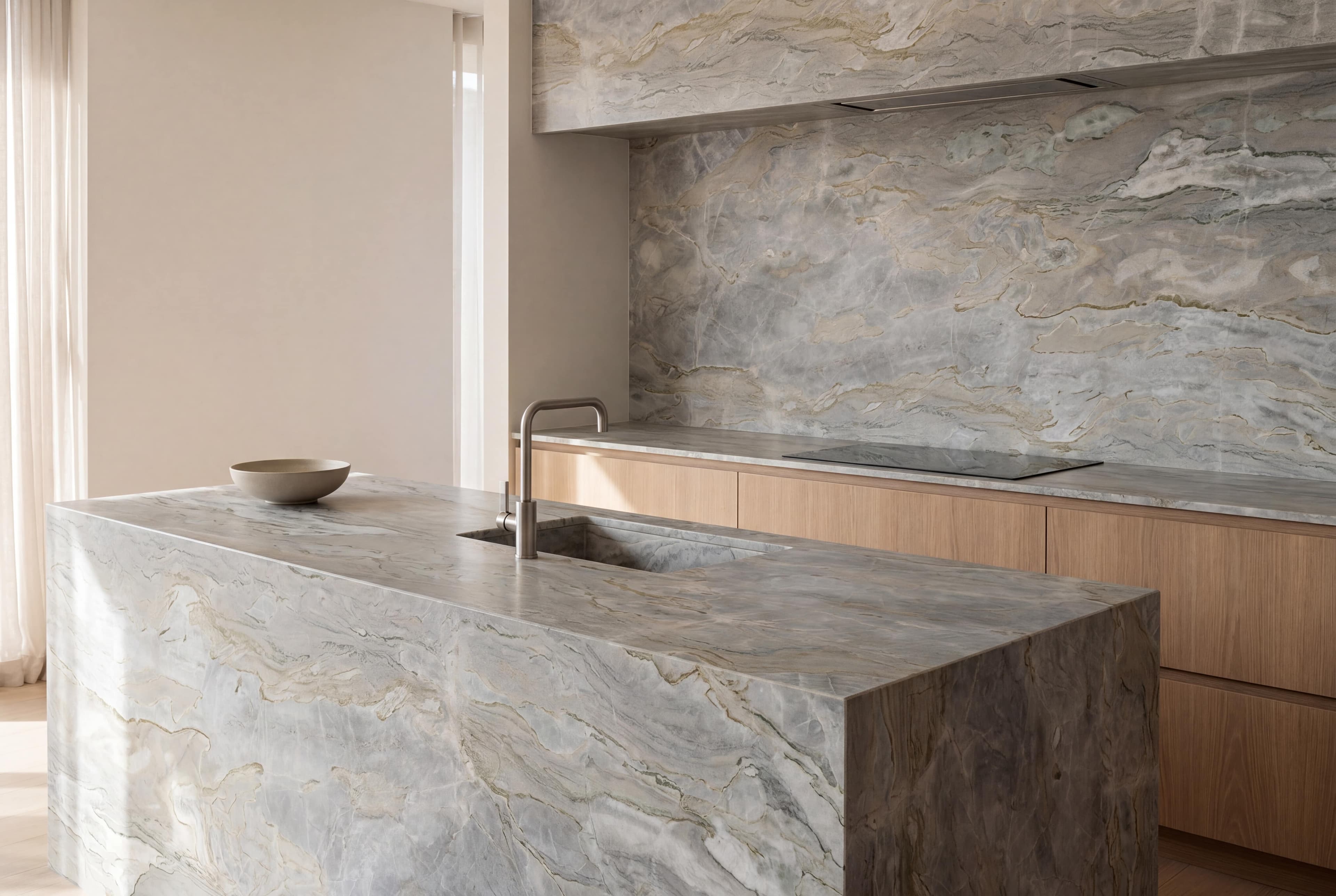
Super Cedar is defined by fluid, directional mineral movement — soft green-grey tonal fields layered with warm veining that travels across the slab.
It reads as a continuous surface rather than a patterned material.
Why it’s performing:
- Introduces movement without high contrast
- Works as a full-slab composition, not a background finish
- Integrates across warm and neutral palettes
- Suitable for islands, vertical surfaces and large-format applications
The Shift
There is a clear move toward stones that operate as compositional elements rather than decorative finishes.
Instead of relying on bold contrast or high-contrast veining, specification is favouring:
- Directional movement across large surfaces
- Materials that define space rather than sit within it
- Reduced segmentation and fewer visual interruptions
- A focus on how the slab reads in full
The result is a more resolved application — where the material carries the architecture.
ORDER A SUPER CEDAR SAMPLE FOR YOUR PROJECT
Breccia Aurora
Country of Origin: Italy
Breccia Aurora is defined by structured veining within a warm, mineral base — offering variation and movement while maintaining composure.
It introduces visual interest without disrupting the overall material language.
Why it’s performing:
- Provides a focal material without high contrast
- Warmer alternative to traditional statement marbles
- Suitable for islands, feature walls and key surfaces
- Balances identity with restraint
The Shift
Feature materials are being used differently.
Rather than acting as dominant visual statements, they are now specified with greater control — integrated into broader palettes rather than isolated as highlights.
Current direction favours:
- Expression within a restrained palette
- Materials that complement rather than compete
- Subtle variation over dramatic contrast
- Consistency across adjoining surfaces
The result is a more cohesive and considered outcome.